Signatures I made ( Rate Please )

SanjiNL

Active member
Veteran
Joined
May 10, 2013
Messages
2,604
Kin
0💸
Kumi
0💴
Trait Points
0⚔️
The first one is pretty cool. The second one is almost as good, but the render doesn't seem to perfectly flow with the background.
 

Khallil

Active member
Legendary
Joined
Dec 8, 2012
Messages
14,783
Kin
53💸
Kumi
0💴
Trait Points
0⚔️
well.. I don't really like them. the first one is a bit okay but needs tons of work. and the 2nd one is too messy and actually kind awful, srry man, but just keep trying and improve your GFX skills :)
 

-R-

Active member
Regular
Joined
Jun 1, 2013
Messages
1,419
Kin
0💸
Kumi
0💴
Trait Points
0⚔️
Awards
1st is nice.

2nd to flashy, picture is not clear, its like you splattered paint all over it.

Keep up the good work though, and ey, dont make em' brake you.
 

Seth 42

Active member
Veteran
Joined
May 26, 2012
Messages
4,235
Kin
0💸
Kumi
0💴
Trait Points
0⚔️
I know no one else really liked them but I kinda really do I know it's flashy and bright but I like the Styling particularly of the second one. There's clearly improvement to be made and I'm no expert but I like them.
 

BazzBee

Active member
Legendary
Joined
Mar 11, 2013
Messages
14,589
Kin
10💸
Kumi
0💴
Trait Points
0⚔️
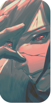
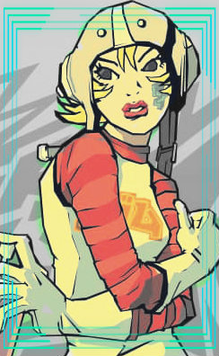
Whats the main Focal ? that's right its the ****ing render, obviously and if you make it as a effect placed, zoom in the render and the first one seems disturbing to the eye as well as the second one does so work on it and, use better fonts next time also always pick HQ renders.

There's no flow in the first signature, it just looks as if you put random c4ds in random places covering up the transparent and placing a render on top of it. the second one hits my liking a bit is cause it has a flow, and nice choice of colors despite how bright it is.

Overall not bad tho not so good either.
 

Beastbomb

Active member
Regular
Joined
Feb 17, 2012
Messages
1,897
Kin
0💸
Kumi
0💴
Trait Points
0⚔️
Awards
Both tags have way too much contrast to the point where they look choppy as anything. When placing your renders just remember that you only need the important parts like the upper half of the body. In these tags you have made the render too small, and try to create something with the background. I know you probably didn't just randomly place those c4d's all over the show, but thats how it appears to others. Had you of kept the render larger it might not have looked so bad, the other thing I would like to point out is the sharpness of the tags. They both look oversharpened, make sure to reduce the opacity a bit on the sharpen layer, lighting is also an issue in both pieces. You can see clearly on the renders where the light is hitting them, so they need a lightsource to go with that lighting. Anyway nice attempts but more practice and tutorials are required:)
 
  • Like
Reactions: Deviation
Top