- Joined
- Apr 24, 2012
- Messages
- 3,192
- Reaction score
- 256
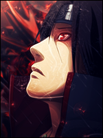
This was your first time c: & when you put it that way I think I would have made the same mistake with the shadows if I ever tried :LYeah the render was the request so, yeah. I noticed that too.
As for the shadowing I had the impression it will be to faded so I added it...guess that it wasn't that good, hehe.
When you said clear background you were reffering at the brushes from behind or at the whole shadow thing?
LE: And of course I was expecting a CnC from you!
Well by clear I meant dont add anything that looks dirty on a white bg which are mainly grey-ish colours which I think it were just the shadows for this one. When properly specified I think they will become okay :3 I haven't tried an air sig but I think blending options>drop shadow should work for now. Mess around there :3
Also I noticed you used a lot of white in there
") Avoid that, use colours that are visible and look neat on a white bg since its gonna get one when posted anyway :L I think you should make the sig with a white bg and delete it out at the end o.ob
Avoid that, use colours that are visible and look neat on a white bg since its gonna get one when posted anyway :L I think you should make the sig with a white bg and delete it out at the end o.ob- - - - - -
hey just noticed your air sig looks even better good with a black bg *o*
LOL and I am the one from whom a cnc is never expected by her friends :L
Last edited: