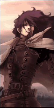
Well done! It is not easy to make a pop out sig .. Tho, you still need more improvement. Here I can teach which part isnt good ..
1) If you look at the sig, you realized that the top one is cut off .. and some part of the bottom too .. And that matters, cause it ruins the whole sig. What you need to do, is to create new project (document) with bigger size so that these effects wont go off the border.
2) The size here is too big to be a signature, it will make it weird-looking and bad for eyes. But dont make it small at the same time, so try to set in the middle.
3) Render is too dark .. Try to add lighter color, and when blending try to lower the opacity .. etc
4) Effects are good too ..
So keep up the good work ^-^