You are using an out of date browser. It may not display this or other websites correctly.
You should upgrade or use an alternative browser.
You should upgrade or use an alternative browser.
[Photoshop] Warrior Tag
- Thread starter Akasha
- Start date
More options
Who Replied?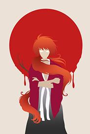

- Joined
- Mar 15, 2012
- Messages
- 3,726
- Reaction score
- 690
It looks nice, however I wouldn't have used such a render for a signature with that kind of width. Turning the right eye blue is a nice little touch which really compliments the used C4D. The only thing which I think is a little bit off, is the text. Without having seen the render, the text looks out of place. Nothing in the sig which makes you think warrior.
One question though: the little vibrant orange smudge, was that done on purpose or did you missed it? Just wondering because it really stands out due to being the brightest piece of orange color in the sig.
One question though: the little vibrant orange smudge, was that done on purpose or did you missed it? Just wondering because it really stands out due to being the brightest piece of orange color in the sig.


- Joined
- Feb 9, 2013
- Messages
- 4,357
- Reaction score
- 808
This tag looks unique, I like it. I think personally that it's actually not bad, its a different style compared to the many other c4d tags. I actually like the color scheme you went with and the idea itself is really nice. I'll give some cnc I guess
Hmm, I think shape overlays on the BG ruin the flow and depth of the tag. I like the idea of the c4ds on the side, but to touch up on the depth, shouldn't blur them too much also further to the middle they should have some sort of light touch ups to blend in
Just touch up on the render don't be afraid to sharpen it. The 2 c4ds swirling around her need some more work. The red one looks like a duplicate of the blue one it doesn't give that realistic effect. If it were me I might even play around with different c4ds or cut/liquefy the ones you currently have to make fit in better
The text also kinda bothers me how it looks kinda brittle, I think if it was kept smooth, would be a lot better.
Anyway great idea, keep it up")
Hmm, I think shape overlays on the BG ruin the flow and depth of the tag. I like the idea of the c4ds on the side, but to touch up on the depth, shouldn't blur them too much also further to the middle they should have some sort of light touch ups to blend in
Just touch up on the render don't be afraid to sharpen it. The 2 c4ds swirling around her need some more work. The red one looks like a duplicate of the blue one it doesn't give that realistic effect. If it were me I might even play around with different c4ds or cut/liquefy the ones you currently have to make fit in better
The text also kinda bothers me how it looks kinda brittle, I think if it was kept smooth, would be a lot better.
Anyway great idea, keep it up

- Joined
- Mar 7, 2012
- Messages
- 15,610
- Reaction score
- 495
Looks cool
I like the mix of colours, nice job
I like the mix of colours, nice job

- Joined
- Feb 17, 2012
- Messages
- 1,897
- Reaction score
- 723
Nice job mate, I love the colors in there but there are a few basics which need attention....
Depth: There is too much blur, making the depth look forced rather than natural. When using blur for depth only use a tiny amount, for example if you used Gaussian blur then only use a setting of about 0.4px. It is always better to start out small, that way you have the option of increasing later on if need be. But 0.4px is plenty as the rest of the depth will come from the lighting and shading as well as edge darkening.
Lighting: I think you have your light sources placed in the correct areas, however the bottom one should be in front of the render but behind the c4d's. I also think it needs to be more of an off white color, something like a very light yellow. Lastly for the lighting, I feel there is too much light in the tag overall. This disrupts the depth and also the atmosphere, balance is the key when it comes to lighting. In other words you need to balance lighting and shading together, if you do this it will improve the depth, atmosphere and the lighting and shading making it much more realistic.
Flow: What you have around the render is great, its working with the natural look and flow that it gives off. But the c4d's around the edges of the tag disrupts the flow, as does the diamond shape brush or texture you have place in there. In all honesty you would have been better off building on what you had around the render.
Text: Although I don't consider this a basic, I will comment on it since you added it in there. I hate to say it but its a bit plain and boring, when adding text it needs to enhance the look of the tag but not take away from it kinda like "seen but not heard" As it is now it needs more substance, try just using standard fonts like impact for the main word and ariel for any sub wording. But change it up a bit by using standard/bold/black and mix it with the tiny text brush you used. Lastly you want to work with your blending options like stroke and gradient overlay, these will help you blend the text in more.
Atmosphere: This is the last thing I feel you need to work on, the best and easiest way to do that is by using adjustment layers. But before these will help, you need to lay the platform first. This is done by combining everything stated above, also don't fall into the trap of adding a whole bunch of adjustment layers at the one time. I normally use about 5 or 6 to finish everything off but I have usually used about 6 or so before final adjustments. These should be spread out throughout the making of the tag.
I really hope this helps, and I am sorry if I sound harsh. This is not my intention, as looking at the OP you only make tags when you get time. So please just keep enjoying yourself and have fun making them, as that is what its truly about. Only take my tips if you are a little more serious about taking them to the next level. I still think its a good tag, but with a bit more attention to the basics it could easily jump a few levels KIU

- Joined
- Mar 12, 2014
- Messages
- 4,211
- Reaction score
- 568
Nice work !

- Joined
- Sep 26, 2012
- Messages
- 12,510
- Reaction score
- 418
Keep practicing.

- Joined
- Feb 14, 2012
- Messages
- 2,044
- Reaction score
- 240
Beast has spoken, haha, but it looks great nonetheless.
Keep it up.
Keep it up.