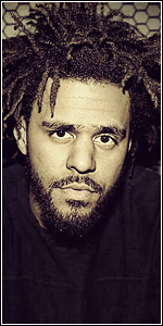
[Photoshop] variance [tag]

LitzSabr

Active member
Veteran
Joined
Mar 13, 2013
Messages
3,045
Kin
0💸
Kumi
0💴
Trait Points
0⚔️
Awards
The blending is pretty good. Lightning as well but could've been better, don't darken out places where it isn't really needed. Like the left shoulder of the render, it's really right but the surrounding area is really dark compared to it, one thing. Other than that, the quality of sig needs improvement, but you'll probably get that with time. Good job ^^
 

Sikk

Active member
Regular
Joined
Jun 23, 2011
Messages
715
Kin
3💸
Kumi
0💴
Trait Points
0⚔️
I really like the c4d work and effects, I think they flow perfectly with the render. I however think you should tone down the intensity of the cyan along with the sharpening because it seems to be affecting the quality of the sig. I'm also not really digging the cyan light source at the very top :p. As for text, I think you need to lower the brightness of that area where it's placed. Other then that I think you have a nice combination of effects and c4ds.
 

Hei

Supreme
Joined
Aug 22, 2011
Messages
23,898
Kin
263💸
Kumi
250💴
Trait Points
0⚔️
Your previous tag was much better,man.
This one is oversaturated and oversharpened.I can't feel the flow there,just bunch of random lights here and there-> terrible lightning.The text is good but has too much glow for my taste.
Good attempt but failed one.Anyway,keep working and you will grasp c4d usage very well soon.
 
Top