Awards
You must be registered for see images
First smudge siggie I didn't completely fail. That's something...
I like the colors on it, you can go ahead and judge it, though.
Click to see the border, it's white.


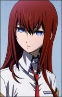
Thanks.7.5/10 ^.^
I hate you too. <3It's nice, but I still hate you. <3


What more could you expect? Simple can be good as well.well i kind of expected more from y :|
but still it's nice


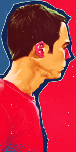
Hahah, there's always smth wrong. ;PIt's awesome. I love the color schemes. Perhaps a little less bright-yellow on the left side otherwise, brilliant. Nothing much to say since you don't leave mistake ever...
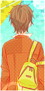
When I get home, hon. .__. It's not sharpened at all now, its the pic.Download some more fonts. >_> And that 'reduced sharpening' is hard to notice for me. =p Lightning is better, but it hides the 'Halibel' text. Anyway I like it. :3

While that may be true, text can also make or break a tag if you use it.Text aint that importnat. >.>
Yeah, the image was a little oversharpened but it was quite easy to work with.While that may be true, text can also make or break a tag if you use it.
I know you mentioned the colours. They seem a little quirky but I personally love them. The yellows against those blues really do work and the text on them is also amazing. You can't say much about brilliant work. The only thing I don't like is the image you've used. It's not very good quality in the sense of that it IS oversharpened naturally, so working with the image itself was hard, and you managed to pull it off.