[Photoshop] This

Anduril

Active member
Legendary
Joined
Mar 17, 2011
Messages
12,892
Kin
42💸
Kumi
0💴
Trait Points
0⚔️
I was asked to revert back to square block sigs :(
so here goes i made three versions
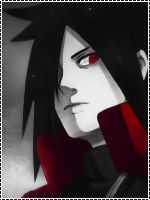
the first
You must be registered for see images


the second
You must be registered for see images


the third[with text]
You must be registered for see images
 

Jokey

Active member
Supreme
Joined
Mar 7, 2009
Messages
21,647
Kin
114💸
Kumi
3💴
Trait Points
0⚔️
Awards
The third one would be the best if you would leave the Stroke out of the whole signature, it kinda ruin's it :p other than that 8/10
 

Anduril

Active member
Legendary
Joined
Mar 17, 2011
Messages
12,892
Kin
42💸
Kumi
0💴
Trait Points
0⚔️
Looking really awesome!
Thanks ^^
not Bad at all thats nice anyway...
Thanks ^^
the third one is more awesome
Yeah i know it is the final work ;)
the third ftw

not bad at all
Yeah its the final...^^
the third is so cool by the way Dr. House how did u get that thing under ur username
Yeah and join a village to get that bar under your ava.....
well they are too simple for my taste :) the text could have been better :) i liked the background , it worked well :) overall nice work done :0
yeah but i had no material to really fill it with :(
Nice work, All awesome.
Thanks ^^
The third one would be the best if you would leave the Stroke out of the whole signature, it kinda ruin's it :p other than that 8/10
Understood but it will kinds become too empty...O_O
first and last one

and good job bro
Thanks ^^
 

Aenigma

Active member
Veteran
Joined
Mar 23, 2011
Messages
2,386
Kin
0💸
Kumi
0💴
Trait Points
0⚔️
See, you are good at sigs when they are rectangular. Nice job :) Only problem I have with it is the size a liiiittle to big but that's personal taste.
 
Top