Awards


gears of war
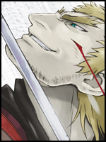
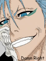
Grimmjow
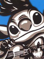
i tried to make the same effect like in linkin park's breaking the habit music video
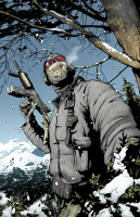
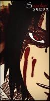
Behind those eyes
song:
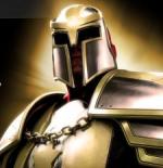
Punisher
You must be registered for see images
Grimmjow
You must be registered for see images
You must be registered for see images
i tried to make the same effect like in linkin park's breaking the habit music video
Behind those eyes
You must be registered for see images
You must be registered for see images
You must be registered for see images
song:
You must be registered for see links
Punisher
You must be registered for see images