Awards
Went 4 simplicity
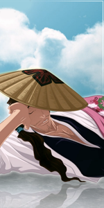
Original:
You must be registered for see images
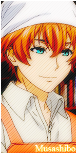
Original:
You must be registered for see images
Last edited:


i dont care about your opinion.text is awful..... get rid of it....
and you didnt do anything here. i dont like it at all =/
duh..u can clearly see that the helmet isnt photoshopped..i mean, it was clearly see i just added adjustmenet layers and text...And I thought you changed the helmet,
..wow..
Nothing really.


Read that down here ....You didn't rly do anything here lol. except changing the levels of the helmet, and adding the effect on the glass and a gradient. That's 1 min work 0_o . Text is awful rly. you could've done a lot better man! sorry :S
oh, you went for simplicity, so you achieve that. I must agree with pesh thought, the text is what you failed at here.