Awards


Well, another signature coming:
Version 1(text by me):
Version 2(text by Niko):
CnC please")
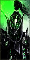
Version 1(text by me):
You must be registered for see images
Version 2(text by Niko):
You must be registered for see images
CnC please