
SOTW #93: ~Katekyo Hitman Reborn~ Voting
- Thread starter Caliburn
- Start date
- Status
- Not open for further replies.
More options
Who Replied?


6 and 8 were the ones that instantly caught my eye.
Hard to choose from.
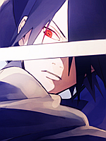
6: Looks good, text is great, colours are nice. The only thing wrong is there is too much black, making it kind of hard to see what you're looking at.
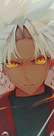
8:I liked this one too, Nice usage of colours and render placement. Only thing wrong is it lacked depth to me for some reason; Then again, I'm not a pro GFX-er") .
.
Hmmmmm. I want to go for 8 but it is missing a little, I wish it had some nice text, just left of the center.
For this comp, 6 will be getting my vote.
Hard to choose from.
6: Looks good, text is great, colours are nice. The only thing wrong is there is too much black, making it kind of hard to see what you're looking at.
8:I liked this one too, Nice usage of colours and render placement. Only thing wrong is it lacked depth to me for some reason; Then again, I'm not a pro GFX-er
.Hmmmmm. I want to go for 8 but it is missing a little, I wish it had some nice text, just left of the center.
For this comp, 6 will be getting my vote.


- Status
- Not open for further replies.