


† SOTW #75: The Fourth Shinobi World War - Week 3: The Division Commanders †
You must be registered for see images
As the Fourth Shinobi World War is getting more and more heated up, the theme's will be based on one of the aspects of the war. This week the theme is around the 6 division commanders: Darui, Kitsuchi, Kakashi, Gaara & Shikamaru and Mifune.
Always remember to read the
You must be registered for see links
before entering the SOTW.And also think about next week´s
You must be registered for see links
.Discuss this contest
You must be registered for see links
.All submissions must be sent via Pm to Caliburn
Put this
on your pm titleSOTW #75: SUBMISSION ~ [USERNAME HERE]
Last day to submit is Saturday, 16th (GMT+1:00) Central European Time (Brussels, Paris, Amsterdam, Madrid)
Good luck everyone ^^
Here are the entries for this week:
- First Submission
You must be registered for see images
- Second Submission
You must be registered for see images
- Third Submission
You must be registered for see images
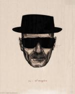
- Fourth Submission
You must be registered for see images
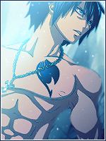
- Fifth Submission
You must be registered for see images
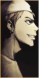
- Sixth Submission
You must be registered for see images
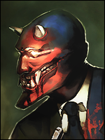
- Seventh Submission
You must be registered for see images
- Eighth Submission
You must be registered for see images
- Ninth Submission
You must be registered for see images
- Tenth Submission
You must be registered for see images
- Eleventh Submission
You must be registered for see images