I'll do some CnC because why not.
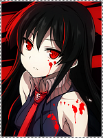
The first one is great, only problem I see is the fact that the light sources don't really agree with the render, the text is great and the colours compliment each other well. Perhaps a bit more blurring would've been nice so the focal point could stand out more, because when I see that I'm looking at a bunch of different things right away instead of the focal like I should.
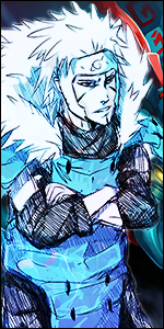
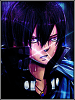
The second one, I like it a lot personally, but it doesn't follow a lot of rules of good signature making. There's no flow, little to no depth, the lighting isn't so bad, the text is awesome, placement is nice. It's very boring behind the render and lilypads so :|..
I'm skipping the third one because I don't like it + it's too small imo.
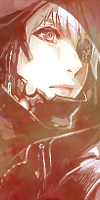
The fourth one is good, just some minor things I don't like. The smudging was pretty good, and you blended the render in with the smudge quite well (a bit of small smudging on the hat would've made it blend even better). The things I'm not a fan of are how you used the blue lights in the smudge. They're probably on another layer on dodge I'm guessing? But the problem is that the lights are there to fill gaps in the smudge, yet the lights go against the flow (because they have no flow) and it sort of ruins the overall smudging when it wasn't really your fault. It would've been nice if you put some blue in the smudge instead of putting some dodged lights to fill the space. Text is pretty sucky, the placement isn't too optimal, the font isn't really complimenting the atmosphere of the render, and the colour is too dark. You seem to be making it a bright tag, then you add dark text T_T..
Skipping the others ones because.. You could probably guess why :|.

") Cnc is always welcome
Cnc is always welcome