[Photoshop] smudgie smudge

Beastbomb

Active member
Regular
Joined
Feb 17, 2012
Messages
1,897
Kin
0💸
Kumi
0💴
Trait Points
0⚔️
Awards
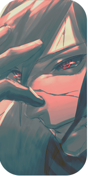
Well I decided to pull out the tablet, dust it off and start getting back into smudging. This was my result after several months away from the smudge theme feel free to CnC otherwise enjoy:)

You must be registered for see images

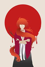
Also here is another battle tag:)

You must be registered for see images
 

Delta

Banned
Legendary
Joined
Jul 4, 2012
Messages
12,187
Kin
1,422💸
Kumi
8,893💴
Trait Points
39⚔️
looks mad dope, but why do people never post the renders <_<, looks wicked though, im waiting for my new Razer naga cord before i try to do smuding, laggs to much with my current mouse XD
 

Beastbomb

Active member
Regular
Joined
Feb 17, 2012
Messages
1,897
Kin
0💸
Kumi
0💴
Trait Points
0⚔️
Awards
looks mad dope, but why do people never post the renders <_<, looks wicked though, im waiting for my new Razer naga cord before i try to do smuding, laggs to much with my current mouse XD
Thanks:) I used too but I don't see the point in posting the render really, as regardless to weather the tag is good or no.t The render will always look different from when you started.

Wow awesome job. You should make me a sig sometime. >_>

How long you been GFXing bro? .-.
Thanks:) I've been doing it for about a year and a half, to 2 years or so. If you can wait a couple of weeks you can have that smudge tag if you like it. But I done it for a battle so you would have to wait till after that is finished:)
 

suki

Active member
Veteran
Joined
Feb 9, 2013
Messages
4,357
Kin
415💸
Kumi
4,180💴
Trait Points
0⚔️
Awesome :)
1st one looks great, very nice ^_^
2nd one is amazing! I really like the structure placement of the c4d and the placement of the render too, I also like the colors. Though only one thing lets it down; read moderately; *_*

- you see the top-left of the sig?
- the green/blue background display doesn't really flow and blend in with the c4d aspects.
- what you could've done was; place c4d there to keep the signature blending and depth in control.. And added green/blue bubble c4d covering it instead.

But anyway, this conclusion isn't really that noticeable, so I'd leave it :3
Keep it up, very good work :)
 

Beastbomb

Active member
Regular
Joined
Feb 17, 2012
Messages
1,897
Kin
0💸
Kumi
0💴
Trait Points
0⚔️
Awards
Looks dope, and love the battle tag :x3:
Thank you:)

Amazing work!

I have to ask,is the second one Crystal Maiden? :)
Thanks a lot and I'm not sure tbh sorry

second one looks awesome
really like the atmo in it
first one...not so much
Thanks and yeah I haven't smudged for a long time, so its bound to have mistakes just trying to get back into it:)

Awesome :)
1st one looks great, very nice ^_^
2nd one is amazing! I really like the structure placement of the c4d and the placement of the render too, I also like the colors. Though only one thing lets it down; read moderately; *_*

- you see the top-left of the sig?
- the green/blue background display doesn't really flow and blend in with the c4d aspects.
- what you could've done was; place c4d there to keep the signature blending and depth in control.. And added green/blue bubble c4d covering it instead.

But anyway, this conclusion isn't really that noticeable, so I'd leave it :3
Keep it up, very good work :)
Thanks and I never even noticed that till you pointed it out lol, but its the forerunner for my entry at this stage.
 

Pavoneo

Active member
Veteran
Joined
May 1, 2012
Messages
2,646
Kin
0💸
Kumi
0💴
Trait Points
0⚔️
Awards
The smudge is awesome, I wish I could smudge like that :3. The second one is awesome as well, some small things I don't like though D: I feel the render was a tad oversharpened in some areas. Her hand in the middle looks rather silly because there's nothing to help blend it in >.<. Her left arm above the small light source, that blue line is a bit distracting and doesn't look too nice, a bit of blurring there and it would've been fine. Also, I feel the light source to the top left of the render (in the upper middle where it's nearly empty) should have a stronger light source because the hood of the render calls for it :3.

don't let my CnC put you down though, I'm just focusing on the few negatives o_o. Like, the depth/flow/text are all amazingingly done and I do love the tag overall.
 
  • Like
Reactions: Beastbomb
Top