[Photoshop] Signature =/
- Thread starter DarkRood
- Start date
More options
Who Replied?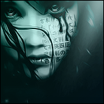


Awards


Awards

Awards


Awards
both miss blending, the render doesn't blend all in both of them, you need to cententrate on that, and in the second one, you trunked it with brushes, kinda like the idea of how they colors are different, red from inside, black from outside, but I don't think that it's bested for this sig, so I like the first more =\
good job 5/10 for both =\
good job 5/10 for both =\

I prefer the first one, it's much more clean. The second one is just clogged up with brushing, which doesn't look too good. =S
However, the render doesn't blend on either. Try using Gradient Maps to blend the colours together.
First - 7/10
Second - 4/10
However, the render doesn't blend on either. Try using Gradient Maps to blend the colours together.
First - 7/10
Second - 4/10
First is better by far, has a nice light source and really makes the render pop out
the second looks messy, the brushes u used didnt helped that much more like dragging down the whole sig.
First-7/10
Second-5/10
the second looks messy, the brushes u used didnt helped that much more like dragging down the whole sig.
First-7/10
Second-5/10