[Gimp] Sig New!!!
- Thread starter Sin
- Start date
More options
Who Replied?


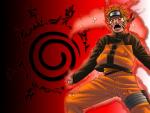
Cool looking , you'r improving =PYou must be registered for see images
Please
have a look
its kinda cool and based on naruto's growth
there was about 32 layers in this
- Your username color doesnt fit in your sig ( maybe it's no need , but you decide )
- I think "secrets" should be moved to right a lil , because "S" looks out of sig =)
Really nice job =) Keep up

Awards

effects looks messy, renders or stocks you've used are placed...better not say =\ text is nasty =\
in this kind of sigs, you should add a bigger size for the canvas so there would a place for every detail in the sig, but it's a good try =]
in this kind of sigs, you should add a bigger size for the canvas so there would a place for every detail in the sig, but it's a good try =]
Awards
Oh to say
I dont have any good text
please give me some good text as I am a failure at text
You must be registered for see links

Awards


Dont wanna offend you...You must be registered for see images
Please
have a look
its kinda cool and based on naruto's growth
there was about 32 layers in this
Its messed,even more than my works,text is sucky,no blending
You are using Gimp,obviously so I cant help u dude

Awards
kinda...actually the main spot of the siggy is lost,you should have to put one render as main :/i did blend....slightly
Awards


Awards
Awards
look here:Oh to say
I dont have any good text
please give me some good text as I am a failure at text
You must be registered for see links
and nice pic