Mehh, too much "good! nice!" I mean I like the positive and all but I would love some criticism @_@
It's because they don't know anything about GFX and do it for the post count.
You must be registered for see links
The yellows and reds seem very random of you ask me. If you're using anything Ezio or Altair I believe you should really be using a nice black/blue/red colour scheme, since they usually fit well together and they match the colours of the render you've chosen. Not to mention the light blue you've chosen for the text seem awfully too random. I can't really say too much about it without saying everything isn't the best on it, so I'll leave it at colour.
Positively-wise, you've got a good positioning for both Altair and the text, so props to you in that respect, but just that colour, it's so random.

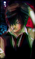
You must be registered for see links
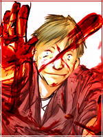
This one is so much better than your Altair one. It's got some nice blending and everything along those lines. Got some nice lighting as well. I really like the smudging you've done with Gin-san's clothes, it looks really good the way you've done it. The C4D usage is nice as well, even if the colour doesn't really fit them theme you've gone with. You need to experiment with Gradient Maps and Photo Filters though to try and improve that colour and being Gin-san out some more, it'd make it so much better.
Also in general, Don't use borders on Overlay or with lowered opacity, since it looks terrible. Also I've never liked making borders go all around the tag, either on parallel sides or not at all.