You must be registered for see images
OnT...
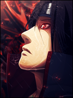
Well, it looks nice and easy on my eyes. Colours blended good.
I find THREE MAJOR PROBLEMS:
LIGHT & DEPTH & TEXT >_O
Light; well just look at the renders gun. The lightsource it is reflects is larger than the white lightsource you've putted in the left corner. Makes it kinda confusing, wich is a shame since you've kinda puzzled it together nice with his head/shoulder area. Make it simply a tad bigger, so it looks more realistic >_O.
Also, there are some spotlight sources that should also reflect the render, that is around it. If you made your own spotlight lights, just duplicate the layer, move it to a good location, blur it, put to soft light. That'd make it more realistic aswell as better. It's kinda picky to work with but i think it's worth the amount of time.
Depth. Well, i gotta say this is the biggest problem..
The overall tiny dots that are scattered around the image has no depth.. It doesn't make much sense.. Blur many parts of the layer(i assume it's a fractal/C4D?). Gives more dynamic to THAT layer. . .
There's only one part where the hints of depth is revealed. That's the well-lit up part behind the render. But is is infact so much blurred that it makes the rest of the picture look lame(in the depth department).
I suggest this as well. . . capture the entire image, make three copies. On copy one make a Gaussian blur, strenght about.. 5,1Px. Put that layer on 50% opacity. Now go to the secound duplicated layer, go on filters - blur - blur more. The third layer should not be edited in any way, put that layer under the other two. Then just erase the blurred part where you want your focal to be, and don't erase the blur on the overall environment.
(I don't have P.S myself atm, so i can't show you U_U).
Text. Well, look at it. Looks.. bad, dull and slightly depressing. Needs more work, try make 3D texts and find tutorials on: deviantart.com
With that being said. I find it pleasing to the eye(as i said), but there are three major flaws, and as Mina said it looks kinda messy, and some parts are cheap. Example: The blue(semen looking things, whatever they are O_O). Looks lq, and doensn't belong >_O,.
Last edited: