Awards
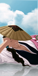
made for an SOTW on an other site.
You must be registered for see images


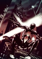
yh, more dark, i know.well it doesnt look bad at all *only text sux) but i would imagine stalker sig more dark and definately not pink :/


and those same people are GFX'ers? i dont understand whats so hard in understanding the reason why those people comment like thati don't understand..? the text looks fine the same people^^^ always have something to say about peoples pics text it really gets annoying.
 its quite obvious answer, they dont like the text!? if you think they are jelous of other people's work or diss other people's work just for fun! ur dead wrong its advices