Did some new things and ended up with this bad boy. Love the outcome.
You must be registered for see images


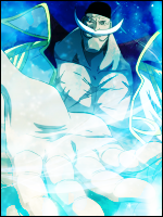
same what -han- says its awesomeThe lighting is awesome and whatever the black thing is its cool")
The c4d's yeah, only used 2 of them. But I'm trying to find a new positing and such, don't have any good ones that would fit it. Thanks for the comment.The brushing/c4d (can't tell) makes it look a liiiittle bit monotoned. Other then that, it looks great. ^_^
pretty epic
Cool
Sharpern it or try to remove some of the things around it.make the image little more clear ! still nice
The text is awesome and the lighting effects is awesome 8/10
Yeah LOL, been trying different sizes. Ill try to change it up a bit, if your interested in editing abit or something i can send you the PSD. See what you can do with it you know.yayy~ kisame made a small sized siggy. xD
signature is just badass although the c4d on right side is pretty prominent, which shouldn't be. <_<
The lighting is awesome and whatever the black thing is its cool
Thanks everyone.same what -han- says its awesome


it seems you are allergic to texts. xDremove the text and it will be your best sig.


I like the textI made one with and without text.
here is the textless version.
You must be registered for see images