Random bleach sig

-Yard-

Legendary Shinobi 🐸
Supreme
Joined
Jan 13, 2011
Messages
25,264
Reaction score
1,349
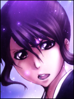
Not done with this yet, suggest what you think would make it look better.


You must be registered for see images


You must be registered for see images


Ps: Butterfly because of the opening theme of bleach in the first season.
 

Crocodile

Anbu Operative 🎭
Veteran
Joined
Apr 29, 2011
Messages
3,547
Reaction score
1,366
It's nice.......BUT

The black borders are too thick,the butterflies don't fit with the theme even though they appeared in bleach,way too much orange in my opinion and the left side looks pretty empty

*Volture mode activated*
 

-Yard-

Legendary Shinobi 🐸
Supreme
Joined
Jan 13, 2011
Messages
25,264
Reaction score
1,349
It's nice.......BUT

The black borders are too thick,the butterflies don't fit with the theme even though they appeared in bleach,way too much orange in my opinion and the left side looks pretty empty

*Volture mode activated*

You suggested that I make the borders thicker on msn >_<
 

Lord Snow

Kage in the Making 👑
Legendary
Joined
Jan 30, 2011
Messages
13,603
Reaction score
559
I love it, but just the borders like Croc said.
 

Ryuu..

Kage in the Making 👑
Legendary
Joined
Jan 16, 2012
Messages
16,752
Reaction score
1,110
Nice work ^_^
 

-Broly-

Kage in the Making 👑
Legendary
Joined
Jan 27, 2012
Messages
13,102
Reaction score
381
You need something else on the left side it looks empty
 

Toruk-Makto

Sannin of the Scrolls 📜
Elite
Joined
Jul 13, 2011
Messages
6,715
Reaction score
365
about the borders , its more like a trend now ppl are making them larger in width's .
I have no issue with it .
But signature isnt balanced , Like if u see in both versions specially v1 the right side is loaded with stuff but the left side lacks a lot . Play a little with levels .
Also i personally liked the way u placed ur render .
Also if ur good with pen tool u may use it to make the left side balance ..


Over all strong concept ... Well done
^_^
 

-Yard-

Legendary Shinobi 🐸
Supreme
Joined
Jan 13, 2011
Messages
25,264
Reaction score
1,349
Nice work ^_^

Thank you ^^

You need something else on the left side it looks empty

Working on that atm xd

about the borders , its more like a trend now ppl are making them larger in width's .
I have no issue with it .
But signature isnt balanced , Like if u see in both versions specially v1 the right side is loaded with stuff but the left side lacks a lot . Play a little with levels .
Also i personally liked the way u placed ur render .
Also if ur good with pen tool u may use it to make the left side balance ..


Over all strong concept ... Well done
^_^

Thanks man ^^

it's not bad.. but butterflies + bleach? naaah xd

lol Gonna change that
 

Howard

Legendary Shinobi 🐸
Supreme
Joined
Aug 17, 2010
Messages
33,078
Reaction score
1,326
Add a Cero coming from Ichigo's mouth.
 

Ebi..

Sannin of the Scrolls 📜
Elite
Joined
Jan 18, 2012
Messages
8,743
Reaction score
637
the brightness is unbalanced, the border yea... ._. and also the butterflies dont blend in well maybe smudge them a little?, overall great work +rep
 

Crocodile

Anbu Operative 🎭
Veteran
Joined
Apr 29, 2011
Messages
3,547
Reaction score
1,366
the brightness is unbalanced, the border yea... ._. and also the butterflies dont blend in well maybe smudge them a little?, overall great work +rep

You obviously have no idea what you're talking about O_O
The borders are actually quite thin compared to the ones I use and nobody actually brought mine up.
 

Ebi..

Sannin of the Scrolls 📜
Elite
Joined
Jan 18, 2012
Messages
8,743
Reaction score
637
You obviously have no idea what you're talking about O_O
The borders are actually quite thin compared to the ones I use and nobody actually brought mine up.

I do ._. just forgot to put about the thickness.
 
Top