[Photoshop] Portgas D. Ace tribute
- Thread starter MihawK
- Start date
More options
Who Replied?


Awards


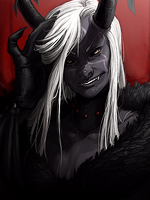
same as yulyn because on left side red is too dark and i hate the box due to left side box ((border)). nothing like border but looks like you did this in hurry at the end of your work. overall nice sig
Last edited:


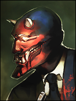


Nice work, you did a good job with the brushing. As far as flaws go:
As others have said, the box behind him doesn't really work with the rest of the design, and the outer glow effect really ruins it. Also, more of his lighting needs to be orange tinged since the fire is doing most of it.

As others have said, the box behind him doesn't really work with the rest of the design, and the outer glow effect really ruins it. Also, more of his lighting needs to be orange tinged since the fire is doing most of it.
That's why you don't merge the layers with the screen or lighten blending options...well the left side (red parts) is waht happens when u merge layers with screen or lighten blending options :/ so not my problem lal
Awards

Because red glow+screen/lighten options + dark background = awesomeness >_>Nice work, you did a good job with the brushing. As far as flaws go:
As others have said, the box behind him doesn't really work with the rest of the design, and the outer glow effect really ruins it. Also, more of his lighting needs to be orange tinged since the fire is doing most of it.
That's why you don't merge the layers with the screen or lighten blending options...
I like the sig.

Awards
Cmon, as someone designing for ears, you should definately know that saving in PNG format = auto merge and all the blending effects on transparent space will look differently )Nice work, you did a good job with the brushing. As far as flaws go:
As others have said, the box behind him doesn't really work with the rest of the design, and the outer glow effect really ruins it. Also, more of his lighting needs to be orange tinged since the fire is doing most of it.
That's why you don't merge the layers with the screen or lighten blending options...:confused:

Indeed, it can be quite an annoying task. There are ways around it though. Did you try a simple copy merged trick? Or if you want to get really fancy, exporting the layers separately? The first one should always work though.Cmon, as someone designing for ears, you should definately know that saving in PNG format = auto merge and all the blending effects on transparent space will look differently )
And of course my favorite way to avoid the effect. Save it on a bg that matches the forum bg and no one will know it's not actually transparent. That is for cheater cheater pumpkin eaters only though!O.O
Last edited:
Awards
Nothing works, trust me im in for png transparent sigs for like 3 years now :/ Blending effect always gets nullified on the transparent part and what goes with cheatah shit, 99% of forums have 2 main different colors for posts, i mean if someone posts and his bg is white the next one is grey, so you'll never be able to match thatIndeed, it can be quite an annoying task. There are ways around it though. Did you try a simple copy merged trick? Or if you want to get really fancy, exporting the layers separately? The first one should always work though.
And of course my favorite way to avoid the effect. Save it on a bg that matches the forum bg and no one will know it's not actually transparent. That is for cheater cheater pumpkin eaters only though!O.O
Hmmm? Did you try a copy merged trick? If not, feel free to upload the psd and I'll give it a go. I've never heard of an impossibility in such matters!Nothing works, trust me im in for png transparent sigs for like 3 years now :/ Blending effect always gets nullified on the transparent part and what goes with cheatah shit, 99% of forums have 2 main different colors for posts, i mean if someone posts and his bg is white the next one is grey, so you'll never be able to match that