[Photoshop] Oh look, some tags.
- Thread starter zenron
- Start date
More options
Who Replied?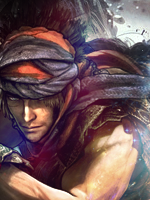


Awards


1st one - the render looks creeeeeepy ._. and kinda out of place dunno why :/
2nd one - empty :/
3rd - dunno, just dont really like it, the background doesnt fit IMO
No offense") D) but I believe you are much better then what youve done here
D) but I believe you are much better then what youve done here
2nd one - empty :/
3rd - dunno, just dont really like it, the background doesnt fit IMO
No offense
D) but I believe you are much better then what youve done here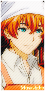
Awards


To tell you the truth, I can only say that I like the 3rd one.
1st signature: I like the style you went, but like stated above the render doesn't fit it. It may be the horns that creep pesh out, but that also might be the reason why it doesn't fit. O_O Iunno It's just not good to me, though the work put into it is good.
2nd signature: I don't believe it's empty at all, but nothing stands out to me. I believe that it should pop out more to impress me, but to no avail. I also hate the text. :O
3rd signature: This is the only one I like. I like the render and how it's positioned, and the effects of between earth/rock is nice as well since it's about the game. It's nice to me, and the text is a little difficult to like, but I got there. It seems as though he is in a rough planet. O_O Anyways I like this one.
All in all I also believe you have more skill than what is showing here. Perhaps your just lacking inspiration, or just can't think of what to do first! O_O You can do it, we want some magnificent pieces of art!