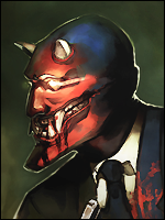
[Gimp] New Signature.

-Tauburn-

Active member
Legendary
Joined
Dec 8, 2009
Messages
10,240
Kin
0💸
Kumi
0💴
Trait Points
0⚔️
its a bit Big for the render try using smaller dimetions and focusing on the main put of the render u want to show, also try playing with each layers Tranparence
 

Yono

Member
Joined
Dec 17, 2010
Messages
153
Kin
0💸
Kumi
0💴
Trait Points
0⚔️
Damn, I'm amazed that you improved so much from one image to the next. It's way better. The best part is that the render is placed accordingly to the rule of thirds. I noticed that you've tried adding effects in the foreground, which would be the sparks brush. You kinda-sorta-failed at that. I do like that the brushing gives it its own flow. That's a plus. The text would've worked better if you did two things. First, there was this one text tutorial I had to refer to every time I made an image, I'll try and find it for you. It teaches you how to improve your text. But placement won't need a tutorial. By using a rule of thirds grid, you could've placed the text along one of the line for the rule of third, which would've worked better than just down on the bottom right. You do need to try a smaller tag size, though. I think you should start with 450x150. Then go down to 400x150, or eventually as low as I go, 325x125. The sizes you currently use are the size of large banners. You do know you can resize using the scale tool? Just click the scale tool, and then on the hotbar click the little checkbox that says "Keep aspect." This will make it so that the image will stay intact. You can then scale the image down to a smaller size (Although you usually can't scale it up, as it will make the render low quality.) Use the scale tool to scale your renders down to a good size for your images. You also don't need the entire body showing, just make sure you go down to at least the shoulders because if you only have the head or head and neck, that is something called "Floating head syndrome," And it'll become hard to add foreground effects.
 

Gobi Gobletsson

Active member
Legendary
Joined
Oct 27, 2010
Messages
19,790
Kin
473💸
Kumi
7,961💴
Trait Points
0⚔️
Damn, I'm amazed that you improved so much from one image to the next. It's way better. The best part is that the render is placed accordingly to the rule of thirds. I noticed that you've tried adding effects in the foreground, which would be the sparks brush. You kinda-sorta-failed at that. I do like that the brushing gives it its own flow. That's a plus. The text would've worked better if you did two things. First, there was this one text tutorial I had to refer to every time I made an image, I'll try and find it for you. It teaches you how to improve your text. But placement won't need a tutorial. By using a rule of thirds grid, you could've placed the text along one of the line for the rule of third, which would've worked better than just down on the bottom right. You do need to try a smaller tag size, though. I think you should start with 450x150. Then go down to 400x150, or eventually as low as I go, 325x125. The sizes you currently use are the size of large banners. You do know you can resize using the scale tool? Just click the scale tool, and then on the hotbar click the little checkbox that says "Keep aspect." This will make it so that the image will stay intact. You can then scale the image down to a smaller size (Although you usually can't scale it up, as it will make the render low quality.) Use the scale tool to scale your renders down to a good size for your images. You also don't need the entire body showing, just make sure you go down to at least the shoulders because if you only have the head or head and neck, that is something called "Floating head syndrome," And it'll become hard to add foreground effects.
I'll try to remember that. ^^... Also, I know that you can scale the things down o.o... But yeah, I've hard to find some good fonts for the text.
 
Top