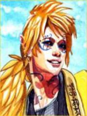
[Gimp] New Signature, again. ^^

Yono

Member
Joined
Dec 17, 2010
Messages
153
Kin
0💸
Kumi
0💴
Trait Points
0⚔️
Nice for it to have a flow, the low-opacity render is like an added focal which looks pretty bad, the background is lacking in effects - I would've liked to see some brushes that go with the flow in there.
 

Yono

Member
Joined
Dec 17, 2010
Messages
153
Kin
0💸
Kumi
0💴
Trait Points
0⚔️
you fail coz of this
You must be registered for see images
That's called a stock, he just used a stock for the background, what's wrong with that? I do that in a lot of my images. He just didn't expand on the stock, he only blurred it for depth and left it as it was I believe.
 

umar islam

Active member
Regular
Joined
Sep 2, 2010
Messages
643
Kin
0💸
Kumi
0💴
Trait Points
0⚔️
That's called a stock, he just used a stock for the background, what's wrong with that? I do that in a lot of my images. He just didn't expand on the stock, he only blurred it for depth and left it as it was I believe.
yes i also believe but it's not that good
 
Top