
[Photoshop] New Itachi Signature 2.0
- Thread starter MasqueradeNX
- Start date
More options
Who Replied?


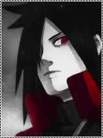
Ok there are too many focal points. I'm guessing Itachi is what you want people to focus on, but then that bright patch over on the upper left is very distracting. Also the red is overdone, and it is too similar in shade, which is why that bright bit is so visible....I liked the first version better, even though it was simpler.