You are using an out of date browser. It may not display this or other websites correctly.
You should upgrade or use an alternative browser.
You should upgrade or use an alternative browser.
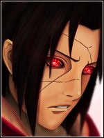
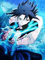
[Photoshop] Naruto Sig.
- Thread starter Synister.
- Start date
More options
Who Replied?
- Joined
- Feb 24, 2012
- Messages
- 671
- Reaction score
- 205
The first looks good to me ... ")
- Joined
- Jun 15, 2012
- Messages
- 3,569
- Reaction score
- 461
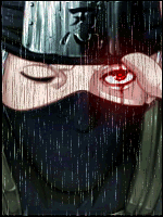
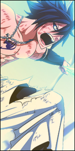
they are both too dark imo
NUNSG Kunoichi
Member
- Joined
- Jul 7, 2012
- Messages
- 67
- Reaction score
- 3
Nice
- Joined
- Jul 19, 2012
- Messages
- 1,641
- Reaction score
- 205
1st one
- Joined
- Apr 22, 2012
- Messages
- 9,831
- Reaction score
- 432
Wow those two are just so...
You must be registered for see images
- Joined
- Mar 13, 2010
- Messages
- 16,212
- Reaction score
- 1,556
No glass.
I wouldn't make the text pop out so much...
I wouldn't make the text pop out so much...

- Joined
- Mar 15, 2012
- Messages
- 4,890
- Reaction score
- 209
1st one, i like the effect it adds. kinda like if it was a picture that could have been but it wasn'tso the pictureis broken

- Joined
- Jul 10, 2012
- Messages
- 1,038
- Reaction score
- 48
I like the first one
- Joined
- Jun 7, 2012
- Messages
- 19,467
- Reaction score
- 537
Awesome O.O
i like the one where it looks like broken glass flying by
The first looks good to me ...
Nice
Thank you1st one
xd thank youWow those two are just so...
You must be registered for see images
I understand what you mean, and thank youNo glass.
I wouldn't make the text pop out so much...
1st one
Thanks
- Joined
- Jun 7, 2012
- Messages
- 19,467
- Reaction score
- 537
Thats what i was going for1st one, i like the effect it adds. kinda like if it was a picture that could have been but it wasn'tso the pictureis broken
, thank you Thanks man2nd one's my fav... great job dude
I like the first one
Thank you
- Joined
- Aug 12, 2011
- Messages
- 1,441
- Reaction score
- 216
I don't really get all those people that think this is awesome.
Really should work on your text placement and your focus. Render is too dark and there is nothing going on. It a plain picture at the background, and naruto render on it with some awkward effect in the first version.
Text and render doesn't blend in much and bad color scheme I would say.
Really should work on your text placement and your focus. Render is too dark and there is nothing going on. It a plain picture at the background, and naruto render on it with some awkward effect in the first version.
Text and render doesn't blend in much and bad color scheme I would say.

- Joined
- Apr 24, 2012
- Messages
- 14,472
- Reaction score
- 572
Wow great job ! .. Double +Rep
I personally prefer the 1st one with the Shattered Glass .
.. Double +Rep I personally prefer the 1st one with the Shattered Glass .
- Joined
- Jun 7, 2012
- Messages
- 19,467
- Reaction score
- 537
I understand, thanks for the advice U_UI don't really get all those people that think this is awesome.
Really should work on your text placement and your focus. Render is too dark and there is nothing going on. It a plain picture at the background, and naruto render on it with some awkward effect in the first version.
Text and render doesn't blend in much and bad color scheme I would say.
- Joined
- Jun 7, 2012
- Messages
- 19,467
- Reaction score
- 537
the first one was cool
Wow great job !
I personally prefer the 1st one with the Shattered Glass .
Thanks guys