[Gimp] My possible new sig, I need some ideas

Zombie

Active member
Veteran
Joined
Oct 14, 2010
Messages
2,676
Kin
241💸
Kumi
6💴
Trait Points
0⚔️
Awards
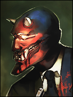
Here is the new sig I just made, unfortunately I forgot to save the original as a .xcf so now all I have is a flattened JPG version. Fortunately, now that I have this basic concept down it shouldn't take long at all to get to a similar image if I want to redo it.

You must be registered for see images


Anyway, any suggestions would be nice. Lyrics are from the song "Ministry of Lost Souls" by Dream Theater.

I at least think this sig is cleaner than my current sig, and smaller. It also matches my avatar! Not to mention my current sig I did in like five minutes. This one took me like 20 minutes. Eventually I might spend over an hour on a sig!

(Also, for some reason I saved my current sig as a png, silly me).
 
Last edited:

Zombie

Active member
Veteran
Joined
Oct 14, 2010
Messages
2,676
Kin
241💸
Kumi
6💴
Trait Points
0⚔️
Awards
Image should be working. Then again, I probably shouldn't be using photobucket should I? Maybe you're image blocking photobucket images? Either way, I really want to go back and align the text better with more precise spacing. Maybe just type out the entire lines and use line breaks. That would pretty much line it up perfectly with the exact same spacing between lines. But to do that ... I'd have to start over! Wait, maybe there is a way to break a jpg back into layers? Probably not but I'll explore GIMP some more and see!
 
Last edited:

yunalover

Member
Joined
Oct 15, 2010
Messages
15
Kin
0💸
Kumi
0💴
Trait Points
0⚔️
Image should be working. Then again, I probably shouldn't be using photobucket should I? Maybe you're image blocking photobucket images? Either way, I really want to go back and align the text better with more precise spacing. Maybe just type out the entire lines and use line breaks. That would pretty much line it up perfectly with the exact same spacing between lines. But to do that ... I'd have to start over! Wait, maybe there is a way to break a jpg back into layers? Probably not but I'll explore GIMP some more and see!
yeah lol i am at school they block everythig give it till next week and this will be gone as well ;D
 

Grim

Active member
Veteran
Joined
Feb 17, 2010
Messages
4,493
Kin
1💸
Kumi
0💴
Trait Points
0⚔️
Awards
k, i got an idea

step ONE
find A10 GATLING gun image that could fit that image's background
sample
You must be registered for see images

step TWO
Add on it FIRE, BULLET EFFECT

Step THREE
Place it behind Zombie

Step FOUR
add lots and lotf of blood *couse GATLING is doing its job:D*
 

Zombie

Active member
Veteran
Joined
Oct 14, 2010
Messages
2,676
Kin
241💸
Kumi
6💴
Trait Points
0⚔️
Awards
No no no no no! Zombies always win! And silly Gatling gun belongs on top of Volkswagen Beetle!

Besides, I don't like your condescending tone. I know the image is terrible compared to what an experienced graphics editor or artist in general would be capable of. But I'm a do it yourself kind of guy and so I make my own sigs. (Whether they're terrible or not).
 

Grim

Active member
Veteran
Joined
Feb 17, 2010
Messages
4,493
Kin
1💸
Kumi
0💴
Trait Points
0⚔️
Awards
No no no no no! Zombies always win! And silly Gatling gun belongs on top of Volkswagen Beetle!

Besides, I don't like your condescending tone. I know the image is terrible compared to what an experienced graphics editor or artist in general would be capable of. But I'm a do it yourself kind of guy and so I make my own sigs. (Whether they're terrible or not).
Gatling > Zombie > small gun... and i just gave u epic idea :|

here's my zombie picture, i made of myself
You must be registered for see images
 

Zombie

Active member
Veteran
Joined
Oct 14, 2010
Messages
2,676
Kin
241💸
Kumi
6💴
Trait Points
0⚔️
Awards
Lindsay Lohan is THE original zombie.

I'm thinking, instead of doing a zoom motion blur, maybe have it set on a level plane with the ground or something. It's really hard to tell the entire background is motion blurred anyway.
 

Grim

Active member
Veteran
Joined
Feb 17, 2010
Messages
4,493
Kin
1💸
Kumi
0💴
Trait Points
0⚔️
Awards
Lindsay Lohan is THE original zombie.

I'm thinking, instead of doing a zoom motion blur, maybe have it set on a level plane with the ground or something. It's really hard to tell the entire background is motion blurred anyway.
back to topic, what will we do about fire power for a background? gatling maybe :D
 

Zombie

Active member
Veteran
Joined
Oct 14, 2010
Messages
2,676
Kin
241💸
Kumi
6💴
Trait Points
0⚔️
Awards
Zombies have all the firepower in their mouth's. Teeth, teeth, and more teeth! I'm thinking the bright clearing in the background is too bright. Maybe I should try to change it to a real deep or dark red?

Version 2 is now available for your viewing pleasure. Opinions and constructive criticism welcome.
You must be registered for see images


Also, anybody know how to move text in GIMP after you closed the dialog box?
 
Last edited:

Sonne

Active member
Legendary
Joined
Jul 23, 2010
Messages
10,902
Kin
0💸
Kumi
0💴
Trait Points
0⚔️
Also, anybody know how to move text in GIMP after you closed the dialog box?
Well,i don`t know GIMP so much,but in photoshop there is a certain tool..

Anyway.

There is something missing to the whole thing,i don`t know what,it just doesn`t seem fiting for a signature.
 

-Tauburn-

Active member
Legendary
Joined
Dec 8, 2009
Messages
10,240
Kin
0💸
Kumi
0💴
Trait Points
0⚔️
Also, anybody know how to move text in GIMP after you closed the dialog box?
yeah u just click the text before u merge it down or merge it with anything else

that shuold open the dialog box again and allow u to move it (the orginal text) as long as u make it on a new layer if u make it on the background layer ull have to redo it on a new layer
 

Zombie

Active member
Veteran
Joined
Oct 14, 2010
Messages
2,676
Kin
241💸
Kumi
6💴
Trait Points
0⚔️
Awards
There is something missing to the whole thing,i don`t know what,it just doesn`t seem fiting for a signature.
Yeah, I feel like something is missing too. I think it might be the singled out zombie in the center, the edges seem kind of blank. Maybe I should bring out larger text to both sides of it?

Maybe I should add a border too?

Also, thanks for helping me figure out how to move the text layers. I was getting a bit frustrated by that!

Here is a bit of a different version, maybe slightly less boring? I don't really like it this way though.

You must be registered for see images
 
Last edited:
Top