Awards
i tried to make a sig that focuses less on a pic, and more on the text.
I agree, it's pretty crappy, but it's also my first try.
I agree, it's pretty crappy, but it's also my first try.
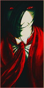
You must be registered for see images


Rofl at your comments, but at least you say the truthIt's supposed to be a text tag, most attention should be given to the text but in this tag here, the effects get the attention not the text so it lacks depth, you just added effects blurred them and added a text and lowered its opacity, so yeah I agree, it is crappy, can't expect an epic result from the first try
good try anyway
i wont argue with all of that, becuz most of it is true. But it was not easy to make. The final thing had 17 layers, and took a while.It's supposed to be a text tag, most attention should be given to the text but in this tag here, the effects get the attention not the text so it lacks depth, you just added effects blurred them and added a text and lowered its opacity, so yeah I agree, it is crappy, can't expect an epic result from the first try
good try anyway
i wont argue with all of that, becuz most of it is true. But it was not easy to make. The final thing had 17 layers, and took a while.
so please understand, i put a lot of effort into it.
 what 17 layer it looks like you added 5


i copied the main background 10 times to add effects and blurs to each one (each in accending opacity)


my latest sig took me about um 40 layers?i wont argue with all of that, becuz most of it is true. But it was not easy to make. The final thing had 17 layers, and took a while.
so please understand, i put a lot of effort into it.