You are using an out of date browser. It may not display this or other websites correctly.
You should upgrade or use an alternative browser.
You should upgrade or use an alternative browser.
[Photoshop] My first 2 avatars
- Thread starter Neon Lili
- Start date
More options
Who Replied?
- Joined
- Mar 10, 2014
- Messages
- 1,610
- Reaction score
- 107
They look like your 100th ones 

- Joined
- May 15, 2013
- Messages
- 58,956
- Reaction score
- 3,171
Hard to give an opinion on what you did without having the original images. They could just be cropped. If you want feedback, please post the stocks.
Anyway, they look good to me, the second one may be a little stretched, but it might just be me. Not much else to say as I can't compare to the originals, but good job. Seems nice.
Anyway, they look good to me, the second one may be a little stretched, but it might just be me. Not much else to say as I can't compare to the originals, but good job. Seems nice.

- Joined
- Mar 11, 2013
- Messages
- 14,587
- Reaction score
- 1,222
The first one looks okay, but the second one looks squeezed and forced. The borders vary on personal preference but i don't like those borders. But comparing this to my first try, you did very good. Nice job.

Neon Lili
Member
- Joined
- Nov 14, 2014
- Messages
- 168
- Reaction score
- 24
Thanks alot that's niceThey look like your 100th ones
thanksNice ^^
thanks ,i should've made it a 150x200 qvqNice, the second one looks stretched tho.
Hard to give an opinion on what you did without having the original images. They could just be cropped. If you want feedback, please post the stocks.
Anyway, they look good to me, the second one may be a little stretched, but it might just be me. Not much else to say as I can't compare to the originals, but good job. Seems nice.
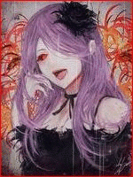
thank you,the second one was just corpped and i added the border and that was about it but i did a littel work on the other one tho.
this the background
You must be registered for see images
and this the render
You must be registered for see images
Cobra(the member who taught me about PS) told me that i should put the stocks whenever i'm doing GFX ,its just that i was too lazy XD
Neon Lili
Member
- Joined
- Nov 14, 2014
- Messages
- 168
- Reaction score
- 24
The first one looks okay, but the second one looks squeezed and forced. The borders vary on personal preference but i don't like those borders. But comparing this to my first try, you did very good. Nice job.
thank you :bouncy:

- Joined
- Mar 12, 2014
- Messages
- 34,484
- Reaction score
- 1,419
For your first 2 avatars, they're pretty good. If I was to give feedback...try putting some more effects on the stocks. You'll find that most look much nicer with the addition of said tools. Also, the 2nd one is a little stretched, but that isn't too much of an issue considering it's your first shot at GFX. If there's anything else I can say, it's probably that you can try finding more stocks, just playing around with them and experimenting. Which effects you like best and what sort of modifications you like having done.
Neon Lili
Member
- Joined
- Nov 14, 2014
- Messages
- 168
- Reaction score
- 24
For your first 2 avatars, they're pretty good. If I was to give feedback...try putting some more effects on the stocks. You'll find that most look much nicer with the addition of said tools. Also, the 2nd one is a little stretched, but that isn't too much of an issue considering it's your first shot at GFX. If there's anything else I can say, it's probably that you can try finding more stocks, just playing around with them and experimenting. Which effects you like best and what sort of modifications you like having done.
I seeO_O
- Joined
- May 15, 2013
- Messages
- 58,956
- Reaction score
- 3,171
Thanks alot that's nice
thanks
thanks ,i should've made it a 150x200 qvq
thank you,the second one was just corpped and i added the border and that was about it but i did a littel work on the other one tho.
Cobra(the member who taught me about PS) told me that i should put the stocks whenever i'm doing GFX ,its just that i was too lazy XD
No worries.
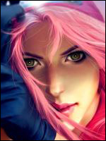
I see. I am not a master by any means imo, but I do know a few things. I did a few adjustments to the first one.
You must be registered for see images
Here is the PSD zipped, just extract it and you can have a look how I did those things. I hope that it helps a bit. [
You must be registered for see links
]You don't have to always, but it's generally a good idea if you are looking for feedback, especially with early attempts.
Neon Lili
Member
- Joined
- Nov 14, 2014
- Messages
- 168
- Reaction score
- 24
No worries.
You must be registered for see images
Here is the PSD zipped, just extract it and you can have a look how I did those things. I hope that it helps a bit. [You must be registered for see links]
You don't have to always, but it's generally a good idea if you are looking for feedback, especially with early attempts.
Ohh thank you,I'll definitely will
(I would have repped you but it says I can't Lol)
- Joined
- May 15, 2013
- Messages
- 58,956
- Reaction score
- 3,171
Ohh thank you,I'll definitely will
(I would have repped you but it says I can't Lol)
No worries, thanks for the thought. Lol

- Joined
- Mar 18, 2013
- Messages
- 46,067
- Reaction score
- 1,935
Thanks alot that's nice
thanks
thanks ,i should've made it a 150x200 qvq
thank you,the second one was just corpped and i added the border and that was about it but i did a littel work on the other one tho.
this the background
You must be registered for see images
and this the render
You must be registered for see images
Cobra(the member who taught me about PS) told me that i should put the stocks whenever i'm doing GFX ,its just that i was too lazy XD
I took the render and BG and applied some minor adjustments, it's always nice to work or mess around with adjustments until you find it appealing, even if they're minor, it makes the avatar stand out a lot more.
You must be registered for see images
Neon Lili
Member
- Joined
- Nov 14, 2014
- Messages
- 168
- Reaction score
- 24
No it's not your eyes I guarantee Lol thanks btwFirst one is good and second is stretched a bit...
The borders are not really matching but it maybe my eyes...
Woah yours looks much"cleaner"(if that's the word)I took the render and BG and applied some minor adjustments, it's always nice to work or mess around with adjustments until you find it appealing, even if they're minor, it makes the avatar stand out a lot more.
You must be registered for see images

- Joined
- Sep 26, 2012
- Messages
- 12,510
- Reaction score
- 418
This thread became a GFX battle lol

Neon Lili
Member
- Joined
- Nov 14, 2014
- Messages
- 168
- Reaction score
- 24
The first one's cute.
The second one is a bit stretched but others have told you that already anyways, keep improving you have potential
thanks *_*