[Photoshop] Meh
- Thread starter Mina..
- Start date
More options
Who Replied?


Awards


Awards
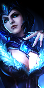
Yeh, I know, should've placed things better. Thanks.O_O It looks pretty damn good.
I think if you would have maybe organized it a lil bit better it would have been even greater.
I like the color scheme and how the render blends in with the BG.
Yeah, tho I'm pretty bad at texts. I tried adding smth but it didn't quite work for me. xD Thanks.<3 it!
I see the left side as a space for text!

 Meanie... Y u so epic?
Awards


Awards
yeaah its meh .. i have seen much better from you min :\
but okay ..
focal is little messed up you darkened some parts but its not enough in this tag imo cuz these sparkles are messing it maybe some gaussian blur could help
also you little messed up lighting that light from bottom of her head is matching render with shadows and etc but from top of her head it outta place imo yea you blended that part but it looks weird you could move your render more to top and create only one light
overally it seems little over darken also
but your work with sparkles c4ds and blending is awesome :3

Awards
I have to agree with Just L on this one. The render itself just seems a little dark and doesn't seem to suit the concept you were going for. Also there's something off about it, but I can't exactly put my finger on it. I think it's the colour scheme you went with, but still not sure about it.
Awards
yeaah its meh .. i have seen much better from you min :\
but okay ..
focal is little messed up you darkened some parts but its not enough in this tag imo cuz these sparkles are messing it maybe some gaussian blur could help
also you little messed up lighting that light from bottom of her head is matching render with shadows and etc but from top of her head it outta place imo yea you blended that part but it looks weird you could move your render more to top and create only one light
overally it seems little over darken also
but your work with sparkles c4ds and blending is awesome :3
Yeh, I agree with you guys. I didn't pay enough attention to the light. Thanks.I have to agree with Just L on this one. The render itself just seems a little dark and doesn't seem to suit the concept you were going for. Also there's something off about it, but I can't exactly put my finger on it. I think it's the colour scheme you went with, but still not sure about it.