
[Gimp] Meh, was bored and made a signature.
- Thread starter Gobi Gobletsson
- Start date
More options
Who Replied?


Awards
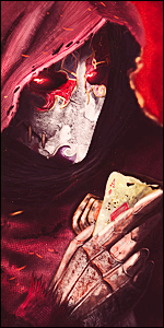
Well, I've tanned down the render, made some changed in the background, made the border fuzzy, well I must admit I didn't use much time on it, but I guess that what you get when you're bored and out of ideas. ^^...

First, the border is bad. You should really get over thick, fuzzy borders. I used to be a fan of them too, but they're really killing your images. Second, I'm going to tell you to stop now with using distort filters. I used to use them with every single image I did, I didn't have one image without a distort filter. But really, the sharpnesss and the ugliness and the bad colors and the ugh ._. Too much to explain in criticism, so forget that. Alright. First, kill the border. The background is sharp and the filter is bad. The colors don't match. And you picked a bad render that is low quality. To fix it, remove the border. Use a different background, maybe a gradient map. No filters. And you can use a better render. Almost forgot, kill the lighting star, it's bad. You know, you shouldn't make images like these and upload them and claim you were bored. It's like an excuse. If you're doing an experiment, then don't upload it unless you intend to make it an actual image in the long run. Test out the filters, figure out what is ugly and what is good. You should really, really, download a resource pack and follow some tutorials.
@Sapna - I know exactly what he did. He first put some color on the background, then did a distort filter, I'm going to guess the filter he used was waves. He then slapped on the render and added a nova star, then topped it off with a fuzzy border. This is exactly what I used to do, but nobody ever gave me any harsh criticism that would make me cry. That's the only way to improve imo, get harsh criticism and cry. After that, I am motivated to do better, and follow every last tip I get in the evil, harsh criticism.
This is weird, I never imagined myself being the one giving harsh criticism a while back.
Last edited:

So you understand now,ehFirst, the border is bad. You should really get over thick, fuzzy borders. I used to be a fan of them too, but they're really killing your images. Second, I'm going to tell you to stop now with using distort filters. I used to use them with every single image I did, I didn't have one image without a distort filter. But really, the sharpnesss and the ugliness and the bad colors and the ugh ._. Too much to explain in criticism, so forget that. Alright. First, kill the border. The background is sharp and the filter is bad. The colors don't match. And you picked a bad render that is low quality. To fix it, remove the border. Use a different background, maybe a gradient map. No filters. And you can use a better render. Almost forgot, kill the lighting star, it's bad. You know, you shouldn't make images like these and upload them and claim you were bored. It's like an excuse. If you're doing an experiment, then don't upload it unless you intend to make it an actual image in the long run. Test out the filters, figure out what is ugly and what is good. You should really, really, download a resource pack and follow some tutorials.
@Sapna - I know exactly what he did. He first put some color on the background, then did a distort filter, I'm going to guess the filter he used was waves. He then slapped on the render and added a nova star, then topped it off with a fuzzy border. This is exactly what I used to do, but nobody ever gave me any harsh criticism that would make me cry. That's the only way to improve imo, get harsh criticism and cry. After that, I am motivated to do better, and follow every last tip I get in the evil, harsh criticism.
This is weird, I never imagined myself being the one giving harsh criticism a while back.
")


You shouldn't be applauding him, it's gonna make him think that he's doing it right. At his level, he doesn't know how to incorporate lighting, I'm sure of that.Nice lighting.
Awards


No you're right, he shouldn't be applauding him, why would we do that to amateurs??? They just need hard criticism, no applause, absolutely no applause until they reach your standards...You shouldn't be applauding him, it's gonna make him think that he's doing it right. At his level, he doesn't know how to incorporate lighting, I'm sure of that.
-______________________________-
Yup. That's totally true, even though you were being sarcastic. Although, it's not that they don't get applause until they reach your own standards, it's that they don't get applause until you can't find anything wrong with an image.No you're right, he shouldn't be applauding him, why would we do that to amateurs??? They just need hard criticism, no applause, absolutely no applause until they reach your standards...
-______________________________-