You are using an out of date browser. It may not display this or other websites correctly.
You should upgrade or use an alternative browser.
You should upgrade or use an alternative browser.
Megaman tag ._.
- Thread starter -R-
- Start date
More options
Who Replied?
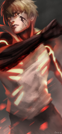
Alright mate, where do we start xd Overall I must say that the signature looks decent and that I see how much effort you put into making it. Now there are small details that I want to point out which you can fix, or not:
- The first thing that my eye caught is that the render is not really HQ and not rendered perfectly, by this I mean that you can see these small white thingies from the actual stock. That's not cool at all, because it just ruins the whole signature. Always pick HQ and perfectly rendered renders, that's a MUST in graphic design, because the render is the main focal of the signature.
- I, personally, would have made the actual render a bit larger so it can cover more space, because what I see in your signature is some 'not filled up' spots, which show the background and it doesn't look very professional.
- The light. I think that you should keep that in mind, you either make it light or dark, but not both at the same time.
Now, to sum everything up, I must say that you are progressing and that you should definitely keep up the good work, man! For first time I actually like what you did with the text and with the blurred parts. Keep working on how to light the whole scene and also work on your depth. I like what you did though, so just keep practicing. Practice makes the master and you indeed have the abilities to become one.")
- The first thing that my eye caught is that the render is not really HQ and not rendered perfectly, by this I mean that you can see these small white thingies from the actual stock. That's not cool at all, because it just ruins the whole signature. Always pick HQ and perfectly rendered renders, that's a MUST in graphic design, because the render is the main focal of the signature.
- I, personally, would have made the actual render a bit larger so it can cover more space, because what I see in your signature is some 'not filled up' spots, which show the background and it doesn't look very professional.
- The light. I think that you should keep that in mind, you either make it light or dark, but not both at the same time.
Now, to sum everything up, I must say that you are progressing and that you should definitely keep up the good work, man! For first time I actually like what you did with the text and with the blurred parts. Keep working on how to light the whole scene and also work on your depth. I like what you did though, so just keep practicing. Practice makes the master and you indeed have the abilities to become one.
Last edited:

Naruto The Savior
Member
- Joined
- Jun 11, 2012
- Messages
- 31
- Reaction score
- 4
It looks awesome.

- Joined
- Sep 26, 2012
- Messages
- 12,510
- Reaction score
- 418
Dat mega >_>