[Photoshop] Magic Does Exist

Casidesia

Active member
Elite
Joined
Apr 22, 2009
Messages
8,372
Kin
0💸
Kumi
0💴
Trait Points
0⚔️
Awards
You must be registered for see images


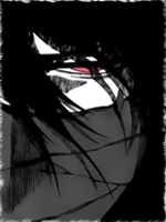
okies...trying new brushes...
i know the text is kinda hard to read... >.< but it was the only text i could find that seemed to go with the signature itself...
tried a few new things....
anyways, CnC?


Without Fading Hair-
You must be registered for see images
 
Last edited:

Casidesia

Active member
Elite
Joined
Apr 22, 2009
Messages
8,372
Kin
0💸
Kumi
0💴
Trait Points
0⚔️
Awards
Sorry... What is?
why did you say oh my god?
you're pretty intresting person :|

on topic: the both versions of sig look good to me :p I like brushes and render and even font isn't that bad except if I wouldn't know your username I couldn't read that there's "CoCo" written on it =/
thanks. ^^
yeah, i noticed that. i almost put my other username on it, but that would have been even more illegible i noticed >.<
 

Xylon

Active member
Legendary
Joined
Jan 7, 2009
Messages
19,292
Kin
352💸
Kumi
268💴
Trait Points
0⚔️
Awards
the one without fading is pretty cool, the text is nice but its too thin i cant see properly, try bolding it (specially "does")
all together its pretty nice
 

Casidesia

Active member
Elite
Joined
Apr 22, 2009
Messages
8,372
Kin
0💸
Kumi
0💴
Trait Points
0⚔️
Awards
the one without fading is pretty cool, the text is nice but its too thin i cant see properly, try bolding it (specially "does")
all together its pretty nice
it didnt look that good in bolding, i did try it >.<
thanks also ^^

pretty nice
thank you.
2nd Version Pwns, And The Text Is Something That I Don't Like ;)
^^
i see.

I really like it ^^
well done (Y)
thanks alot ^^
 

-~Krissy~-

Active member
Regular
Joined
Oct 12, 2008
Messages
1,216
Kin
0💸
Kumi
0💴
Trait Points
0⚔️
I like the second version best. <3

And I agree with Cali about the faded hair, it just doesn't seem right.

Text was a very good choice but it came out bad. D:

Otherwise good job. ;D
 
Top