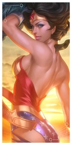
its a lil to dark but i like the text one but u should try and lighten it up so u can see sum details as its kinda hard to tell whats goin on with all the black
It's suppose to be dark, its just the style I have, when it's to bright it ruins some of the stuff. Thats why I enjoy dark type work, but it's really not that dark.