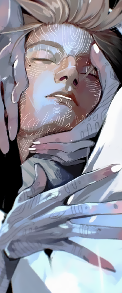
Just remembered that i've made a sig before my leavin' for vacation ..mostly left it da way it was (Just worked a lil on its colorin' ) ,hope u like it ^^
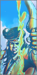
../arrived yesterday
You must be registered for see images
i don't think it's very dark ,But yea it's dark ..Nice and very dark in a way.
it would be a gr8 point for me if u tell me why u think it looks that way ,so that i can fix its probs ..i agree about its sharpness ,i'll try to do somthin' about it../ thanks manI think it looks like a render simply placed on the stock background and the whole signature looks way to Sharp.
as someone said render doesnt blend, and im pretty sure every thread you open you will find same answer as top CnCthanks Buddies ..
it would be a gr8 point for me if u tell me why u think it looks that way ,so that i can fix its probs ..i agree about its sharpness ,i'll try to do somthin' about it../ thanks man
didn't blend it enough ,my fault ..i'm still new with C4d renders ,thanks dudeThe render is too dark and it needs to be blended. The background is also messy.
yea it did make sense ..thanks ,ur explanation really helped me n i'm sorry for da trouble :flaw:as someone said render doesnt blend, and im pretty sure every thread you open you will find same answer as top CnC
render/BG doesn't blend, is it a problem, or no one can come up with better explanation ? I suck at CnC'ng. but i will point out one issue with this render here. When you make a background and it has it's light sources you should add em on the render tho, make it blend. speciahttp://img.tokyobase.net/forums/images/smilies/tongue.gifly dark spots.
now did it make sence ?:sy:
havn't tried changin' da Bg color ,But yea ,guess that can help its blendin' too ..Thanks budNice attempt =] i think the background would blend alot better if it had the same colour as her hair or just do a little bit of extra blending =] nice work