You have alot to improve upon.
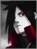
First of all, you made the render too dark.
Smoke effects : Bad (Because the render isn't blended into them and also because the smoke has no reason to be there and doesn't fit in at all).
The sig overall is bad quality, it might be the 15 effects you put on it.
Text: Bad choice of font, bad placement, bad color, doesn't fit in at all.
Bad flow in the sig. You can see one of the lines going diagonally one way, and the Hibari standing diagonally the other way, so there is a crash of flow.
Hibari isn't blended into the background at all, and all those flower brushes you used don't fit in at all...
Bad contrasts.. Bad color theme... What is that pink stuff doing in there?