
Ok this is the 4th sig I ever made. And first one like this. ( all the last three was like my own sig)
and this is the stock I used ( had to cut the hair and style it myself) :
In original color:
C&C are both welcomed as I'm really new to this and I want to know its flaws.
You must be registered for see images
and this is the stock I used ( had to cut the hair and style it myself) :
You must be registered for see images
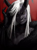
In original color:
You must be registered for see images
C&C are both welcomed as I'm really new to this and I want to know its flaws.