Awards
For a SOTW on MPGH.
Theme: NAruto/Bleach
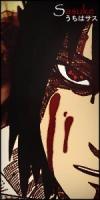
Haku
Theme: NAruto/Bleach
Haku
You must be registered for see images


what do you mean ``if you made it all`` ??pretty sweet! good job man if you made it all.. if not I'd say it's still pretty good except the render does it all ;D

yh, i know what you mean, but i use this size for this style.Awsome
Though I must say I'm not a fan either of that canvas size. I rather have them wider, but smaller.

Ty.asa mentioned, the size is pretty bad considering what you have i n it. it should be more like a 300x200, or something vertical. the canvas has a lot to do with how the tag looks.
colors are very boring. whatever you did to it messed it up. try some selective color layers, and brighter gradients.
I dont like whats going on on the left and right sides. looks pretty crappy, and takes away from the sig. if you had just the focal, and the white area, it would look a lot better.
kill the text. it is taking away from the focal. I recoment that you never put text until you get better.
lighting here is a mess. i see some on the top, bottom, and even the sides. decide on the light source before you make the tag.
Overall, i think that ive seen better from you. There is no color scheme, and it makes it hard to look at. to tell you the trugh, it looks like a swamp. kind of ugly colors that way. the sharpening looks good, however the blurring is not so good. I would try to focus more on the focal, and the white part around it.


 However as some people mentioned, I have issues with the size as well but whatever.