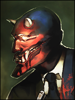
Well made a Galactus sig. The text might be a bit hard to read but it says "The Creator Galactus Devourer of Worlds"
Well enjoy, Cnc Would be appreciated.
Well enjoy, Cnc Would be appreciated.
You must be registered for see images

Really badass. I love how it looks, but I never liked galactus. The colors flow, the way it looks is high quality and everything is placed well. Love the text, and your right, the text underneath is kinda hard to read.Well made a Galactus sig. The text might be a bit hard to read but it says "The Creator Galactus Devourer of Worlds"
Well enjoy, Cnc Would be appreciated.
You must be registered for see images
Thanks allot, I usually always use those borders for my works. The font was hard to pick i dont have any of those handwritten fonts really. Just the basic CS4 stuff. But I personally hate trying to do the text. Never works for me.You couldn't have picked better, it was placed well for the color, it's just the font. Seems like it's sensitive for size or styles for the blue text making it hard to choose it and use it.
Anyways good stuff, I like the cinematic borders on the top bottom making it seems better. I was mesmerized by the color and the focus on galactus that I didn't see them.


Thanks lol dont know what it means but its helpfulCNC??: :|
")
Wow that is some nice thing its been sometime since i saw galactus any where again if u count out FF rise of the silver surfer (i think he was not shown in it!!)
As for the sig if it is lightening that galactus has in that hand it would be better to sharpen it ......the color choice is excellent but it would have been better if the background would have been more machinic (These are just my views just my taste plz dont bother if u dont like)
The sig is awesome though
My pleasureThanks lol dont know what it means but its helpful
Okay Ill take the advice and change it up tomorrow and see how it works out, ill change the background and stuff and sharpen the lightning. Thanks for the Cnc.
There was a glow there but the toher c4d parts ruined it so i have to change it all up tomorrow.It is a really really nice sig, I like it. If I would change anything on it or improve it would be the blue text think you could find a better color and font. Also the pink in the lower right corner seems "undone" if compared with the other pink glow parts.
Long text like that makes a sig look nonprofessional.
Also,you use the same pattern every time.
C4D
Render
Random Glows.
Have a little originality mate.