Awards


It's some time since I have posted something in here. ~_~'
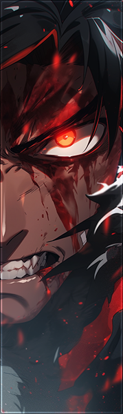
Anyways, this was actually made for a request, but I did like to see what people thinks about it.
And yes theres two versions. <.<'
CnC.
Anyways, this was actually made for a request, but I did like to see what people thinks about it.
You must be registered for see images
You must be registered for see images
And yes theres two versions. <.<'
CnC.