Awards


So whenever you're roaming around this place and looking at all the graphics people make and showcase here to see if the fans like it, what is it that you look for in whatever it is that the people make? Do you look for how well and executed the style of the graphic is? Is there a certain style you like to look out for? Let us know and discuss and things. ")
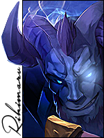
There's two things which I primarily look out for when making graphics, and rating them in general, since this is a pretty active place apart from other forums which I've been on, and that's colour and text.
Colour is a huge must for me, any graphics whether they be an avatar, an icon or larger piece of work, colour is something which I feel makes something stand out to me a lot. If the render or stock used shows quite a few colours originally, then I feel like emphasis msut be placed on those colours which are most dominant and vibrant, instead of making it very monotone. Colour should be brought out as much as it can for anything to look good in my eyes.
Another big thing for me is text used in graphics. While it isn't a must to use text, it's just added, and it really should only be added if you feel like it's missing something, or can be placed somewhere without looking bad. Text placement for me also falls in where to place the text as a whole. You don't want text away from a focal point, as you want to try and look at a focal point and expand from there. The font also matters, but not as much as placement. Also when people overlay text it never looks good unless you're really good at that sort of thing.
Share your thoughts about what you like to see.