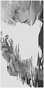
Well comments here are reason I quit posting on NB design hall long time ago. Like 0 useful info, I'll try to give you some.
Everything seems right yet everything is wrong a bit.
Lets start with Quad-Focal, dude no, my eyes are running like cat chased by dragon. You put 2 light points on hands, which make them focal points + text at the bottom + face on the top, it doesn't work this way, try to follow rule of thirds (it's the simplest way, I can go in more depth if you want). So here you should put more focus on face + place text near it, little bellow righter or lefter doesn't matter.
Depth, its bit wrong as well, looks pretty plain to me, sharpen face/focal or put motion/gaussian blur on tag and mask un-needed parts.
Text itself looks okay-ish, it's just too mainstream already, try to be more unique, that will give tag the "wow" feeling.
Atmosphere is good as well, you did decent job here.
Most distracting part for me is topaz, you over-used it soooo much, just because cool guys on gfx sites use it doesn't mean it's any good, imo topaz is awful for tags, you can achieve same effect with high pass and don't have this plastic-ish feeling in the tag. Seriously don't use topaz or use it less, much less.


")