[Photoshop] Crysis
- Thread starter Anduril
- Start date
More options
Who Replied?


Awards
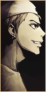
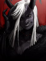
The old dude huh he will probably turn this to ashes !!!7.5/10
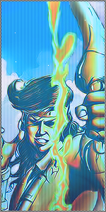
If you don't know how to handle Colours then don't Use to much Color's the Font is Better then before but meh, i let this one for Nocturnal.
Ryujin jakka that he is!!! xd xd xd xd

Awards


Awards
weird i never saw those pixels when i made it!!??not bad but you overused colors i think and i dont like the left side of sig where u can see "pixels" also i like the sharp one more
could it be due to the GIF format in which i saved the sig? i'll check!

I kinda like it, 1st more
I just think that there are to many colors, the letters are cool, the render looks bad because of the colors (i think), but it is cool
7/10
(im talking but im not better -.-")
I just think that there are to many colors, the letters are cool, the render looks bad because of the colors (i think), but it is cool
7/10
(im talking but im not better -.-")
Awards

The Makers of this game are going to have an orgasm after watching this, for sure. xd
OT: There is no composition at all, neither flow. And you should think about a theme before making any tag. In your tag, every single thing is looking random. The partly smudged render, the background, the colors and ofcourse the text. In the second version I guess you made the text you focal?
OT: There is no composition at all, neither flow. And you should think about a theme before making any tag. In your tag, every single thing is looking random. The partly smudged render, the background, the colors and ofcourse the text. In the second version I guess you made the text you focal?
Awards
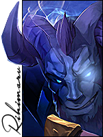
well i did and yes i dont think no theme it is just random and i dont think i have seen any1 doing anything according to a theme!!The Makers of this game are going to have an orgasm after watching this, for sure. xd
OT: There is no composition at all, neither flow. And you should think about a theme before making any tag. In your tag, every single thing is looking random. The partly smudged render, the background, the colors and ofcourse the text. In the second version I guess you made the text you focal?
not here at least
Last edited:
Awards
well i did and yes i dont think no theme it is just random and i dont think i have seen any1 doing anything according to a theme!!
not here at least
Go and search for some old threads in this section, you'll definitely find some examples.