[Photoshop] Crysis
- Thread starter Ali G MPGH
- Start date
More options
Who Replied?


Awards


Awards

Awards
ty guys..im glad sb replied..GFX section s eems dead now -__-
alot ppl check this thread, but like 1/10 comment here.. lol
alot ppl check this thread, but like 1/10 comment here.. lol


Awards


Awards
yh, many ppl dislike them, on other sites too, i thought it would look cool..it wold look cool if i have blended them in better.

Awards
omg, ill wake up this setion
lets see... colors look good. the purple is kind of overpowering. in the bottom left, those sparks (i assume you used a displacement map) are very choppy. do smtn about that. the tag overall is off-balance. the text on the right helps, but not too well. either add more to the right, or crop it out. the thing that dosnt make sense is the bg. it is all blurred and wavy. aside from the colors, it dosnt seem to fit the render. also the text needs to be changed. you should not put text at low opacities like that. either have solid text, or no text.
and you need to get new fonts. this does not fit the tag at all
It also seems that all your recent tags are the same exact thing. its getting boring. you need to break out of that shell
Awards
ty for CnCYah, they were pretty the same, this one is a bit different.omg, ill wake up this setion
lets see... colors look good. the purple is kind of overpowering. in the bottom left, those sparks (i assume you used a displacement map) are very choppy. do smtn about that. the tag overall is off-balance. the text on the right helps, but not too well. either add more to the right, or crop it out. the thing that dosnt make sense is the bg. it is all blurred and wavy. aside from the colors, it dosnt seem to fit the render. also the text needs to be changed. you should not put text at low opacities like that. either have solid text, or no text.
and you need to get new fonts. this does not fit the tag at all
It also seems that all your recent tags are the same exact thing. its getting boring. you need to break out of that shell
Help me to break out of that shell..lol...i got no inspiration..no ideas..and if i search for tuts, i get nooby ones, and i can do 100x times better than the sig in the tut..
Well..idk if ur the right person, since u were using your smudge style over and over..

Awards
na, i only did that a few times. but i suggest looking in the graphics critique section on PR. i learn a lot, and get insperation by looking at other ppls workty for CnCYah, they were pretty the same, this one is a bit different.
Help me to break out of that shell..lol...i got no inspiration..no ideas..and if i search for tuts, i get nooby ones, and i can do 100x times better than the sig in the tut..
Well..idk if ur the right person, since u were using your smudge style over and over..

MangekyoUser
Member

Awards
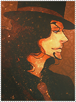
The colours are a little bold in this piece Ali. It could probably do with a gradient map or two. I don't mind the red lines coming from the mask as someone else pointed out. It doesn't exactly detract from the sig. However, there are two lines that come from the right shoulder which don't really fit with the flow. The depth in awesome in this sig.
As always, I wish it was smaller, but I guess that is still up to personal opinion.
As always, I wish it was smaller, but I guess that is still up to personal opinion.