[Photoshop] Cross Marian and Luffy

Dino

Active member
Regular
Joined
Apr 2, 2011
Messages
1,818
Kin
118💸
Kumi
480💴
Trait Points
0⚔️
You must be registered for see images


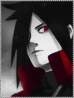
I tried to use the glowing line affect and this is how it turned out (my first time).
You must be registered for see images


You must be registered for see images


CnCs will be appreciated! :)
 

Aenigma

Active member
Veteran
Joined
Mar 23, 2011
Messages
2,386
Kin
0💸
Kumi
0💴
Trait Points
0⚔️
It's better without the lines I think. But the lines aren't that bad...

The Luffy sig is too...all one color, if you know what I mean.
 

Dino

Active member
Regular
Joined
Apr 2, 2011
Messages
1,818
Kin
118💸
Kumi
480💴
Trait Points
0⚔️
It's better without the lines I think. But the lines aren't that bad...

The Luffy sig is too...all one color, if you know what I mean.
I'm not really all that good when it comes to gradient maps but still in the learning process. Hopefully, I'll get better at it :p

Thanks for the critique :)
 

Aenigma

Active member
Veteran
Joined
Mar 23, 2011
Messages
2,386
Kin
0💸
Kumi
0💴
Trait Points
0⚔️
I'm not really all that good when it comes to gradient maps but still in the learning process. Hopefully, I'll get better at it :p

Thanks for the critique :)
Yeah well practice makes perfect.

I don't know if expressed this in the first post...I do like them. I was just saying those were some little problems. They're good honestly.
 

Toruk-Makto

Active member
Elite
Joined
Jul 13, 2011
Messages
6,715
Kin
0💸
Kumi
2,500💴
Trait Points
0⚔️
Awards
nice work ,

as blue said luffy sig in full of red doesnt looks nice at all ! still not bad 7/10

above ones are great nd glowing line effect shud be more like a little larger so tht it covers the whole character nd the left side which looks a little plain (also covers it) also the text used is not looking good ... Overall 8/10
 

Dino

Active member
Regular
Joined
Apr 2, 2011
Messages
1,818
Kin
118💸
Kumi
480💴
Trait Points
0⚔️
nice work ,

as blue said luffy sig in full of red doesnt looks nice at all ! still not bad 7/10

above ones are great nd glowing line effect shud be more like a little larger so tht it covers the whole character nd the left side which looks a little plain (also covers it) also the text used is not looking good ... Overall 8/10
thanks for the cnc...:)
 

Anduril

Active member
Legendary
Joined
Mar 17, 2011
Messages
12,892
Kin
42💸
Kumi
0💴
Trait Points
0⚔️
The luffy one is composed of too many bright colors as such it hurts the eyes....and u don`t want the viewer to tear there eyes away from the signature so work on that....
Also now moving to the signatures above if u want to create a glowing line make then make sure that actual line is pretty much small as is not the case here and then make the glow spread it looks better than this because here i think the render gets covered by that line....
The first one is OK though.
 
Top