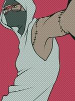
I know there's something wrong with it, but I just can't seem to put my finger on it... Also all my comments will be directed at Pesh's finish since that's what it is, a finish.
For starters, it looks a tad oversharpened for me, especially in the text area. I'm not a big fan of the textures you've used, they look too rustic for my taste, but it seems to fit, colour and all. I like how you've brought out the light on the sword though, really nice touch. :3
I really do think of anything, you should've erased your sharpen over the left egde of the focal, and the text to it blends in that little bit more and your text doesn't look grainy.