- Forums
- Role Playing Forums
- Naruto Role Playing
- RPG Character Biographies
- Declined / Dropped Biographies
You are using an out of date browser. It may not display this or other websites correctly.
You should upgrade or use an alternative browser.
You should upgrade or use an alternative browser.
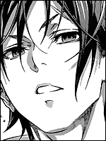
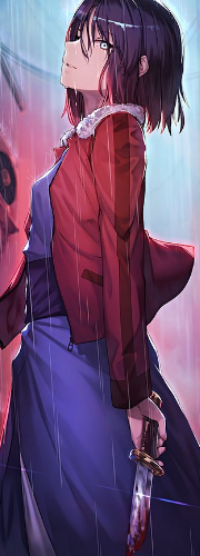
Byakuran || 白蘭
- Thread starter Edward
- Start date
More options
Who Replied?
I've got a lot of issues with this bio. The first and most obvious mistake that you made is the color scheme. The monotony of the repeated faint purple color is completely overbearing. When utilizing color, it should function to effectively highlight the colors that are going to be present as a result of the character's appearance. Replicating the colors used in those pictures does nothing to this effect.
The next big problem is with the images. One of your first images results in a text wrapping, which is both horrendous and ugly. Several of the later images in the bio look squished and distorted. Images should server to break up the text, yet you seemingly felt the need to randomly throw in poorly cropped pictures of your character's ugly mug. This is all surprising to me as I know that you've used one of Baldy's avatars before. I would have assumed that you had some sort of knowledge and instinct regarding artistic choice as a result of this.
This is only the tip of the iceberg in terms of mistakes that you made in this bio. In the name of courtesy, however, I will not call you out on them in this public forum. Expect a PM from me within the coming hours to outline your mistakes.
c:
This is a joke. Good bio, Ed.
You must be registered for see images
- Joined
- Apr 19, 2014
- Messages
- 9,058
- Reaction score
- 298
Awesome Biography.

- Joined
- Nov 14, 2010
- Messages
- 23,222
- Reaction score
- 646
Byakuran sucks 
- Joined
- Feb 18, 2013
- Messages
- 14,439
- Reaction score
- 286
Nice bio but images are stretched out.
- Joined
- May 31, 2013
- Messages
- 12,820
- Reaction score
- 289

- Joined
- Apr 17, 2010
- Messages
- 13,401
- Reaction score
- 503
"Shakujo Training"
You put the correct name of the style in there right now. :|
You put the correct name of the style in there right now. :|
- Joined
- May 31, 2013
- Messages
- 12,820
- Reaction score
- 289
"Shakujo Training"
You put the correct name of the style in there right now. :|
<_< no comment about da bio? kden. U_U
The whole Nico Robin hype sure ended quickly ;p
OT: I like this character much more.
It was a phase... this one probably is one too, ahha.


- Joined
- Jun 23, 2009
- Messages
- 14,952
- Reaction score
- 320
Tsuna Awakens is meant for... Tsuna. xD Otherwise nice bio!
- Joined
- Apr 3, 2014
- Messages
- 5,429
- Reaction score
- 141
Pshhh. I could take this bio on u___u (not)
Great bio
Great bio