[Photoshop] Bloody Wedding
- Thread starter Hotarubi
- Start date
More options
Who Replied?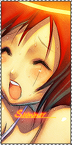


Awards


Awards


Not bad but it would be even better if you eased up on the background cause i think it's too strong for that render which you rended really great but oh well we are all learning with time +rep to you 
Thanks. I'm really new to this , I'm learning though.Seems alot like the 3rd birthday. Rendered very well though BG and effects could use some work
I did that, but since the BG was too sharp , a blury render wouldn't look good on it. I am too lazy to go all the way back and correct it.WOW, looks great^^ maybe you should add a motion effect in it
Thank hun :hug:
Thanks =Pvery cool girl
Yeah I know but then it would be too plain and that's all I know to fill the BG up *^*Not bad but it would be even better if you eased up on the background cause i think it's too strong for that render which you rended really great but oh well we are all learning with time +rep to you
Yeah I saw that now. I'm a noob so forgive my silly mistakes.But I'm too lazy to spend another 15 seconds on it. But thanks for pointing that out ^ ^you are missing part of the gun there -.-


Awards


Thanks. I think 7 is generous . I'm only good at rendering because I used lasso alot for coloring drawings.Oversharpened.
Background doesn`t look very good.
Text is...a fail at the very least.
Rendering is pro.
Pop Out effect achieved.
7/10
What I said above. thanks for rating.7/10
Waruiko >_>1.78/10 only good thing is the render.
Thanks.i will not comment on this sig but the one u gifted some one else that was a really cool sig i did not like this much though
6/10
But how do you know about that?!! I sent that in PM!

Awards


Awards

Nice rendering (even brilliant) but that's about it in fact.
The render is not so well-blended, the pop-out is amateurish, the background is awful and text is too simple.
It's the background that poses problem. It's too much of warm colours, vague and unmatched with the render.
Try to use some effect on another background that fits better with the excellent render.

Nice render but i don't like the background.
Small render but big and plain background there's too much space in it. Make the background smaller.. And i also don't like the text
7/10 for the nice render
Small render but big and plain background there's too much space in it. Make the background smaller.. And i also don't like the text
7/10 for the nice render