[Gimp] beginner sig. :)

SoalSlayer

Leaf Village Regular 🍃
Regular
Joined
Apr 30, 2010
Messages
973
Reaction score
281
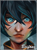
You must be registered for see images

I'm still new to GFX'ng and GIMP and I know I messed up at some point(s).

Violent reactions are welcome. :)

For a beginner thats not a bad effort, text doesnt really work but apart from that its a good effort =]
 

dowhatupreach

Jōnin Strategist 🧠
Regular
Joined
Feb 25, 2012
Messages
1,512
Reaction score
85
i appreciate the feedback guys. thanks a lot. :scorps:

For a beginner thats not a bad effort, text doesnt really work but apart from that its a good effort =]

thanks for pointing that out. i got tired from rendering the stock and just picked up a random font online. xD I'll make sure next time the font stands out.
 

SoalSlayer

Leaf Village Regular 🍃
Regular
Joined
Apr 30, 2010
Messages
973
Reaction score
281
i appreciate the feedback guys. thanks a lot. :scorps:


thanks for pointing that out. i got tired from rendering the stock and just picked up a random font online. xD I'll make sure next time the font stands out.

Hehe completely the wrong idea, the idea of text isnt to stand out but to blend in and be hard to notice. As it is now the font isnt too bad its just too big and the wrong color, try picking a color from the sig like the blue light colour. Dont position font in corners either because it disrupts the flow and draws attention away from the render =] hope this helps.
 

Nerei

Jōnin Strategist 🧠
Regular
Joined
Nov 7, 2011
Messages
1,916
Reaction score
380
Pretty awesome for a beginner + rep

thanks for pointing that out. i got tired from rendering the stock and just picked up a random font online. xD I'll make sure next time the font stands out.

Ooh the font stands out, but not in a good way, shishishi :D


Beginner sigs always fill me up with feelings of Nostalgia <3
 

dowhatupreach

Jōnin Strategist 🧠
Regular
Joined
Feb 25, 2012
Messages
1,512
Reaction score
85
Hehe completely the wrong idea, the idea of text isnt to stand out but to blend in and be hard to notice. As it is now the font isnt too bad its just too big and the wrong color, try picking a color from the sig like the blue light colour. Dont position font in corners either because it disrupts the flow and draws attention away from the render =] hope this helps.

noted and will surely help a lot. thanks. :D
 

Marcuss

Jōnin Strategist 🧠
Regular
Joined
May 2, 2012
Messages
1,487
Reaction score
146
great work for a 1st i like it
 

Yugure

Sannin of the Scrolls 📜
Elite
Joined
Nov 11, 2010
Messages
8,525
Reaction score
731
It's good for a beginner! But I don't like the text, it doesn't add anything to the total picture...
 

Mayhem

Legendary Shinobi 🐸
Supreme
Joined
Feb 8, 2012
Messages
25,814
Reaction score
825
No violent reactions from me. Its good.
 

Beastbomb

Jōnin Strategist 🧠
Regular
Joined
Feb 17, 2012
Messages
1,897
Reaction score
723
Not a bad job for a beginner, just a couple of things to note though are, borders more often than not ruin a tag and you have kinda butchered your border by not erasing it properly. If you want to use borders try using your rectangle marquee tool and decide on the thickness you want for your border then right click and fill after that duplicate the layer and move it to the opposite side as the original. Or just 2-3 pixel stroke it, the rest of the tag is not too bad just a simple case of doing more tags and read a few more tuts and you will be on your way.
 

dowhatupreach

Jōnin Strategist 🧠
Regular
Joined
Feb 25, 2012
Messages
1,512
Reaction score
85
Not a bad job for a beginner, just a couple of things to note though are, borders more often than not ruin a tag and you have kinda butchered your border by not erasing it properly. If you want to use borders try using your rectangle marquee tool and decide on the thickness you want for your border then right click and fill after that duplicate the layer and move it to the opposite side as the original. Or just 2-3 pixel stroke it, the rest of the tag is not too bad just a simple case of doing more tags and read a few more tuts and you will be on your way.

noted. :) thanks for the help. :D
 
Top